Goldstar

Designing a better checkout experience for millions of live entertainment enthusiasts

Team

Me, UX Designer, Front-end Developer, Back-end-Developer

My role

Product Designer, Front-end Development, Strategy

Website

goldstar.com

Introduction

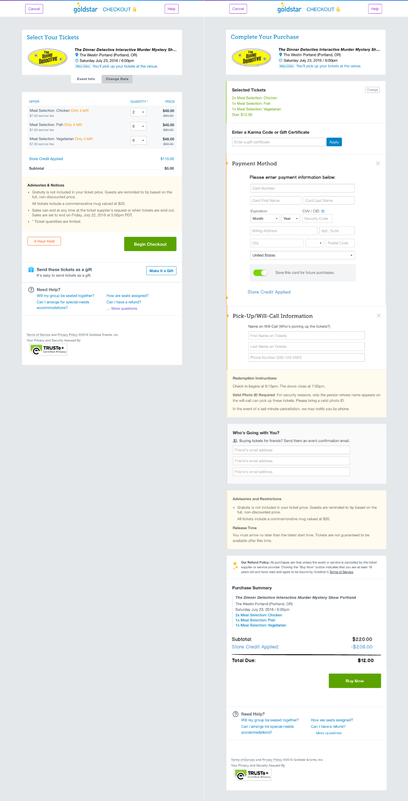
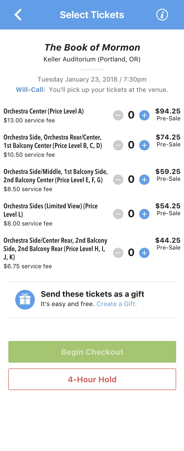
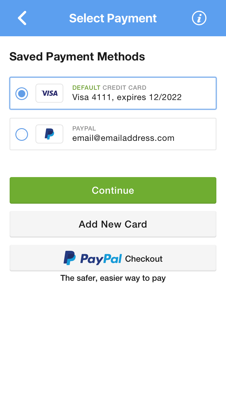
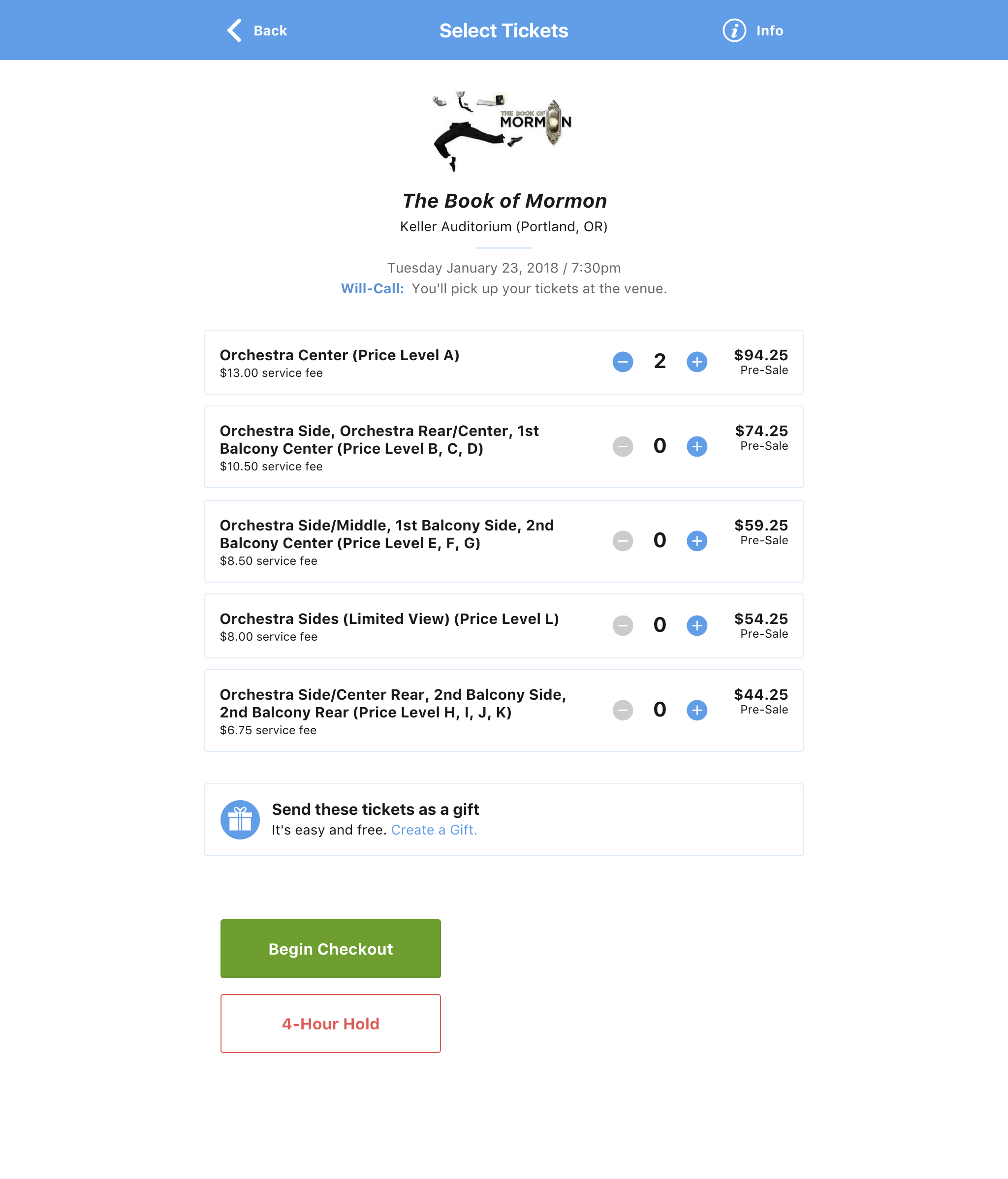
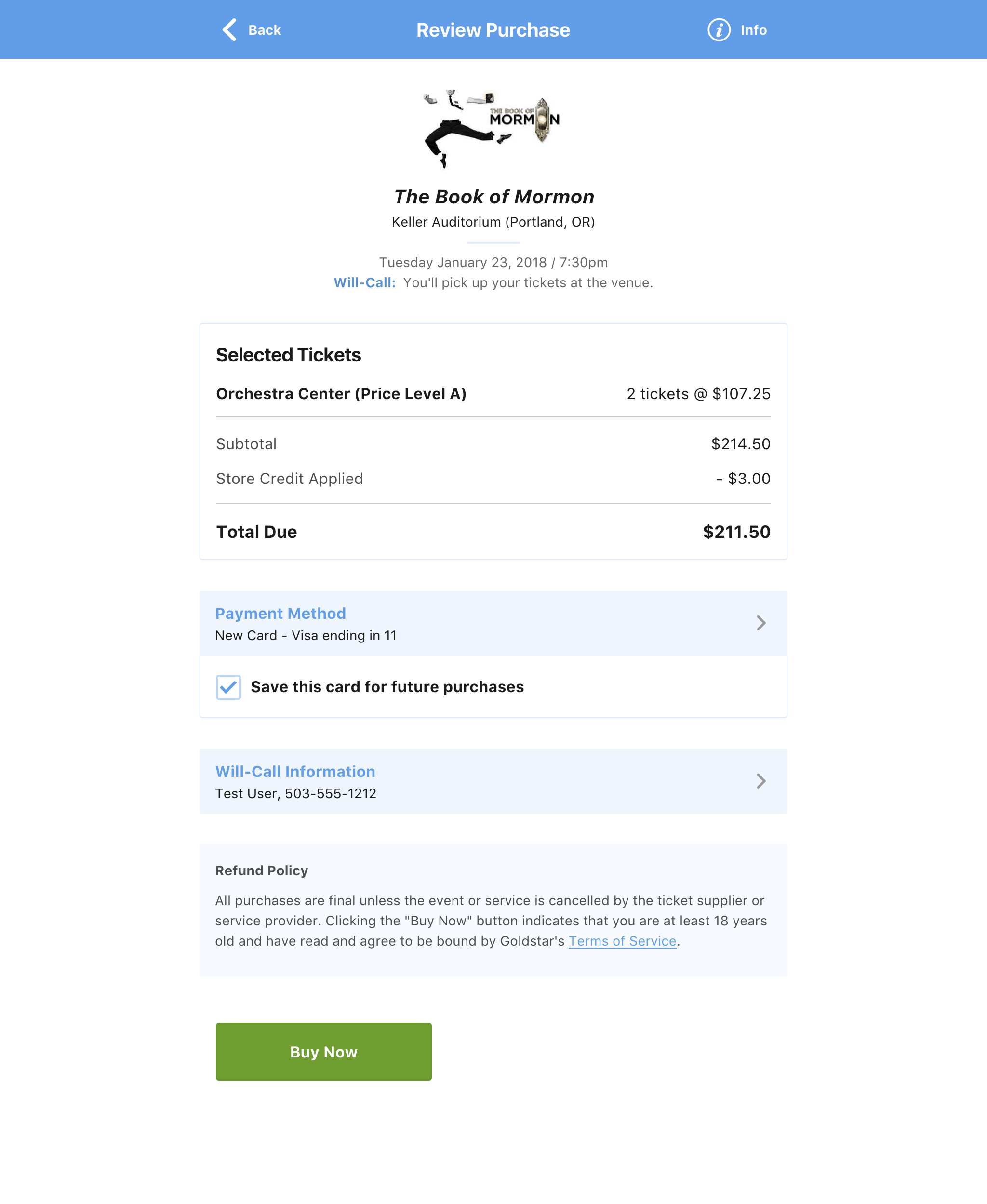
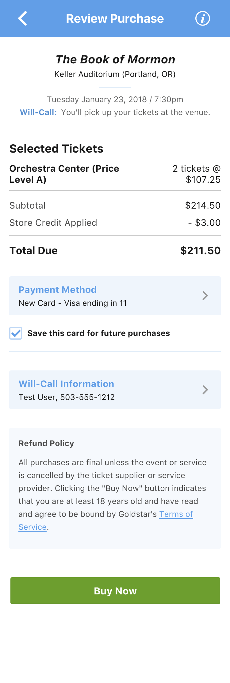
Goldstar is a leading event discovery app serving over 10 million members and 6,000 venues across the US. As user needs and business goals evolved, the checkout process became less effective and more problematic. Creating a more effective experience for mobile users, adding new payment methods, and offering guest checkout meant designing a new checkout from the ground up.

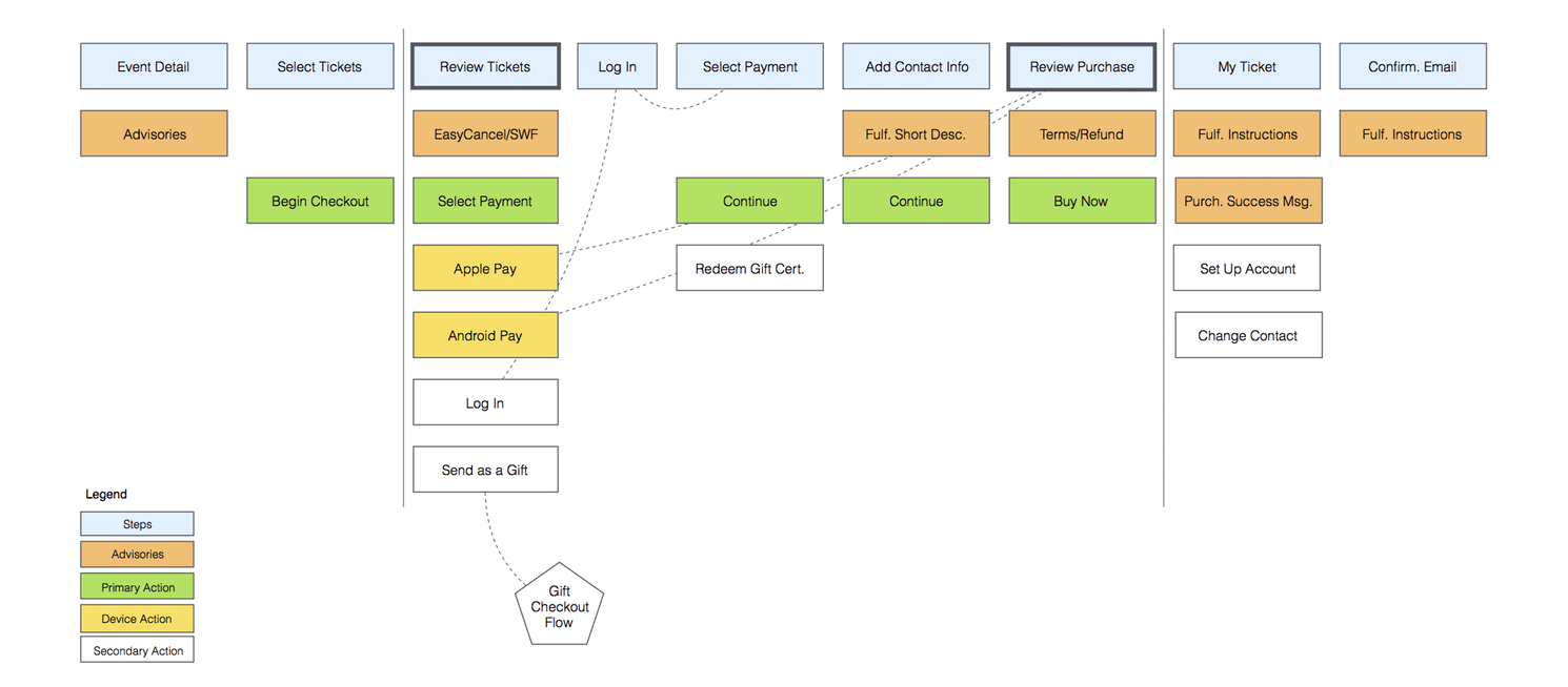
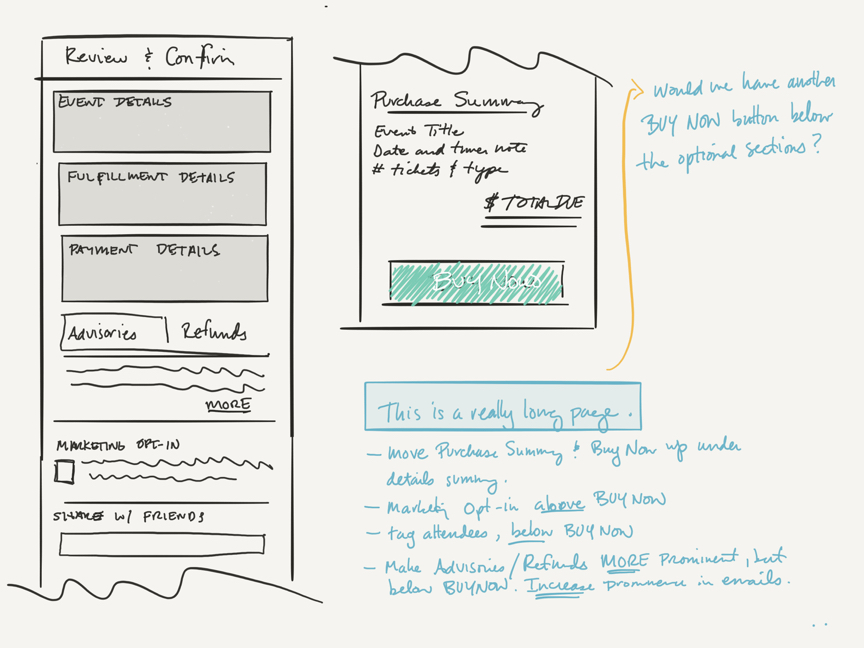
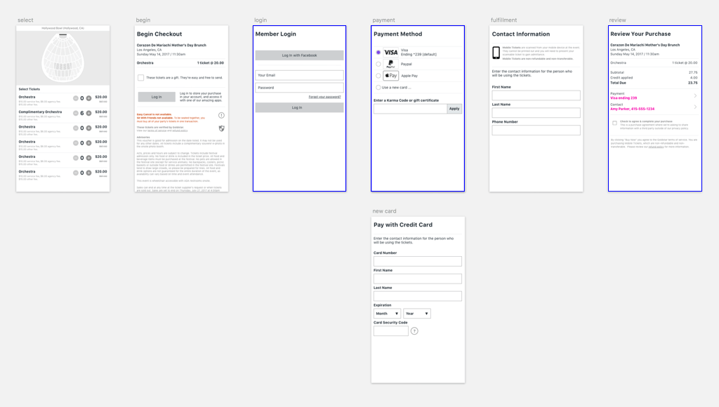
As Senior Product Designer for this project I worked closely with a UX Designer to define user flows, create wireframes, develop prototypes, and extend our design system. Both of us designers worked together with the Front-end Developer on implementation. We utilized analytics and a customized dashboard to track conversions and drive design and development strategy. The result of this project is a task-based, mobile-friendly flow that boosted checkout conversions 13%.

The challenge

To create a better checkout experience our high level goals were to:

  • Make mobile a priority — The majority of purchases happened on a mobile device, so the new solution would need to work equally well for mobile and desktop users
  • Add new features — Expanded payment methods (Apple Pay, Google Pay, and PayPal) and guest checkout capability needed to be included
  • Improve the visual design — Poor visual consistency and bad information hierarchy were hallmarks of the existing design
  • Keep disruption to a minimum — Because of complex business logic we weren't able to A/B test a separate flow
We started from a dark, dark place

The process

The first step was to map out a user flow that would accommodate both the new features and our business strategy. This included analyzing the codebase and having conversations with stakeholders and engineers to record and understand all of the checkout scenarios. Based on this research, I paired with the UX Designer to create the following diagram that was reviewed with the team and company stakeholders:

New checkout user flow, designed to accommodate both the new features and our business strategy
Early sketch exploring a new purchase confirmation screen

The new flow meant breaking the checkout process into individual screens. Each screen would encompass a specific task, like choosing a payment method, entering fulfillment information, or reviewing purchase details. This approach had two big benefits:

A simplified user experience — Individual screens would keep user interactions as simple and straightforward as possible by focusing on one task at a time

A responsive development strategy — A modular flow would enable us to ship smaller updates more often, gauge the effect of specific changes, and iterate where necessary

Wireframes were created for each checkout step and developed into a clickable prototype

Based on the new user flow, wireframes were created for each checkout step. These wireframes were then developed into a clickable prototype that was tested within the company and with Goldstar members. Once the team was confident in the wireframe designs we moved into a staggered design/build phase, implementing one screen at a time. We monitored analytics and a customized dashboard throughout this phase to gauge the impact of our work and drive any necessary iteration.

The redesign

The checkout redesign extended our design system and included other changes to improve the user experience. Here are some of the main areas that were addressed:

  • Reduced visual clutter — The new design focused on improving readability, visual consistency, and information hierarchy to help decrease cognitive load (and make things look nice)
  • Improved accessibility — To make the checkout experience a bit more accessible Aria attributes to assist people using screen readers, color contrast ratios were increased to improve readability, reliance on color as the only way to communicate information was removed, and support for keyboard-only navigation was added
  • Better mobile experience — Form elements were updated with larger touch targets, context sensitivity, and improved validation states

Project results

Over a 6 month period our project team worked closely together to identify issues and opportunities, and to keep things moving forward. We created a more effective checkout experience, improving one of the most critical flows for Goldstar.

Here are some of the improvements we saw:

  • Increased checkout conversions by 13%
  • Decreased submissions with errors by 70%
  • Added support for Apple Pay, Google Pay, and PayPal payment methods